Colour Collection - The Neomodernist
Pure & Original is a Dutch paint brand with a wide range of paints and colours made with respect for human and nature.
All our paint is coloured with 100% natural pigments and we always use a mineral base as much as possible. It’s not surprising that our most popular paint colours are neutrals. The Classico chalk-based paint and Fresco lime paint are often selected in grey and beige tones, for a warm and inviting home living atmosphere.
But next to these muted, natural tones, we have more!
This year, we launch our second ‘Colour Collection’: ‘The Neomodernist’ called. A series of colours which enrich each other perfectly, to create an unexpected ambience.
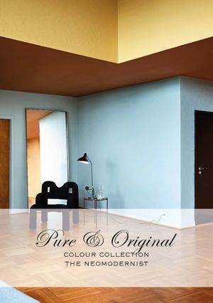
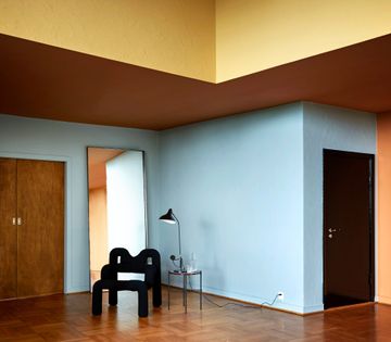
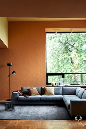
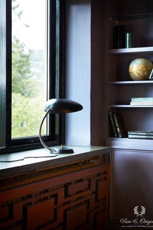
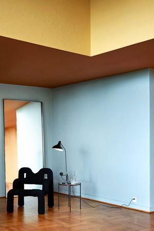
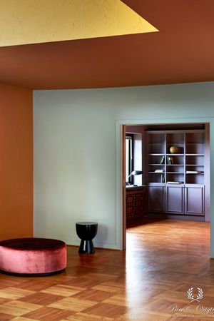
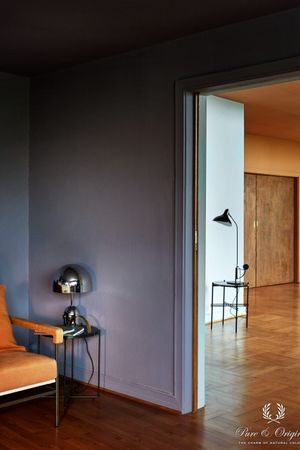
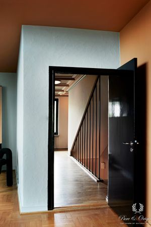
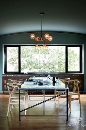
This collection reflected the ‘30s interiors. Warm colours, mixed with cool tints. Orange, yellow, purple, blue and black.
Colour blocking is thé trend in this series. Not too hard, but soft shades in powdery matt finishes, combined with high-gloss black on the window frames and doors for a unique look.
Pure & Original has teamed up for the second time with colour designer Dagny Thurmann-Moe, to show a small collection; a homage to the use of colour in the 1930s Europe.
Bohemian Skin Powder Black Kenyan Copper Honey Glow Polar Blue Blue Reef
Dare with colour
‘The original approach to colours in the modernist era is growing as the source of inspiration. We wanted to show how our carefully developed collection can be used to achieve this form of refined and personalized use of colour’, explains Floor.
Dare to bring more colour into your home
Find a reseller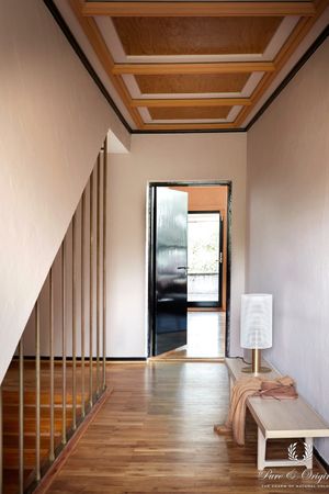
The story of Dagny, colour expert
Like always, when I start a new project, I begin with spreading out all of Pure & Original’s colours across my worktable. This gives me a feeling of what stands out, what feels fresh and new, and what we can reinterpret. What I love about Pure & Original’s colour library, is that it’s filled to the rim with historical colours from most decades from the past and current century, in quality nuances. This means that the colours are not that sensitive to trends, but can be interpreted in almost any trend or style direction. For this collection, we wanted to do something different from last year, but still give a full extravagant colour experience. We have put a lot of work and consideration into what colours we wanted to group together and how.

I knew I wanted to refer to the modernist era and how they used colours – it is so different from what many think – full of crazy and eclectic colour combos, but with a refinement we rarely see today. It was complex, with a deep understanding of how to play with light, colour, angles, materials and shadow, and sometimes extremely over the top. It felt free in a way. So we wanted to tap into that, but with a contemporary approach. The goal is that the colour design feels new and fresh, but also has historical references. Contemporary architecture has a lot in common with modernism, so referencing the use of colours in this project, can easily be done in a home built this decade.
We were lucky to get the perfect location, designed by noted Norwegian architect Ole Øvergaard and finished in 1932/1933. It had the architectural features and qualities we wanted to tell the story. The colours we wanted to use in the collection almost fell into some kind of symbiosis with the architecture. It felt like it had always been that way, that they belonged with the house.
We’re at the beginning of the era where many feel a bit sick and tired of trends. Constantly being reminded of what’s in and what’s out. And it is boring, isn’t it. Not to mention not particularly eco-friendly. And the reaction to these strict rules of how to decorate the “right” way, is making personal choices. Ignoring advice. Instead, working with the architecture of your home, your personality and your own wants and needs. The truth is, sometimes, all the advice on how to work with neutrals, basics etc may not be the right choice for you. It could be entirely different. And this era is about to show us a whole lot of just that. Enjoy!